In this case study, I analyzed an existing website, then restructured and redesigned it with a refreshed look. More information about my process is found below.
Programs used: Adobe Illustrator and Figma. Content and images sourced from: original business website, original business social media page, Unsplash, Pexels.
The final result: a prototyped site redesign with a refreshed feel and improved user experience.
Continue reading to learn more about the roadmap of this case study.
To begin this process, I audited the existing site, keeping note of pain points as well as instances of effective design and user experience. Here are some of my major notes during this process:
Paint points
Logo
- Logo gets lost against the dark background of the navigation bar
- Logo could use a modernized look
- Logo needs to be responsive to accommodate for the website favicon, social media profiles, etc
Menu
- It’s very large so it’s easy to get lost or miss a section
- Too much use of all caps and a decorative typeface for entire sections
Introductory section
- Feels cluttered and repetitive
- Again too much use of all caps and a decorative typeface for entire sections
Contact
- Divided into a lot of sections unnecessarily
- Lots of text feels a little overwhelming
Effective
- Site looks to be designed from a mobile-first approach, which is effective because most people will be looking at the menu using their phones while they wait for a table
- Cohesive use of green and red throughout to match the logo and Mexican flag
- Chunky serif typefaces are fun and suit the content well
- Fixed navigation works well to help users move around
- Menu is generally well organized
Redesign goals
Logo
- Design a modernized, responsive logo, which captures the essence of the original, that can be used in different print and web settings
- Maintain the original colour scheme
Overall
- Redesign the layout of the website for ease of use and improved visual appeal
- Adjust use of colours and typefaces to better highlight information
Introductory section
- Split up between homepage and an ‘about us’ section
- Add instagram feature
Menu
- Add an additional navigation for the menu so users can move between sections easily
- Move PDF menu to the top so it is easier to find
- Move redundant pricing to reduce clutter
- Break up drinks into separate sections
- Make image banners for each new section in the menu
Contact
- Simplify and consolidate repeating information
- Add in simple icons
- Add in google map
Results
Logo
From rough sketches to digital drafts, I chose the final design which I felt struck the balance between the style of the original design and feeling more modern and fresh. At this stage, I also created an icon version which would work well for social media profiles and a favicon.
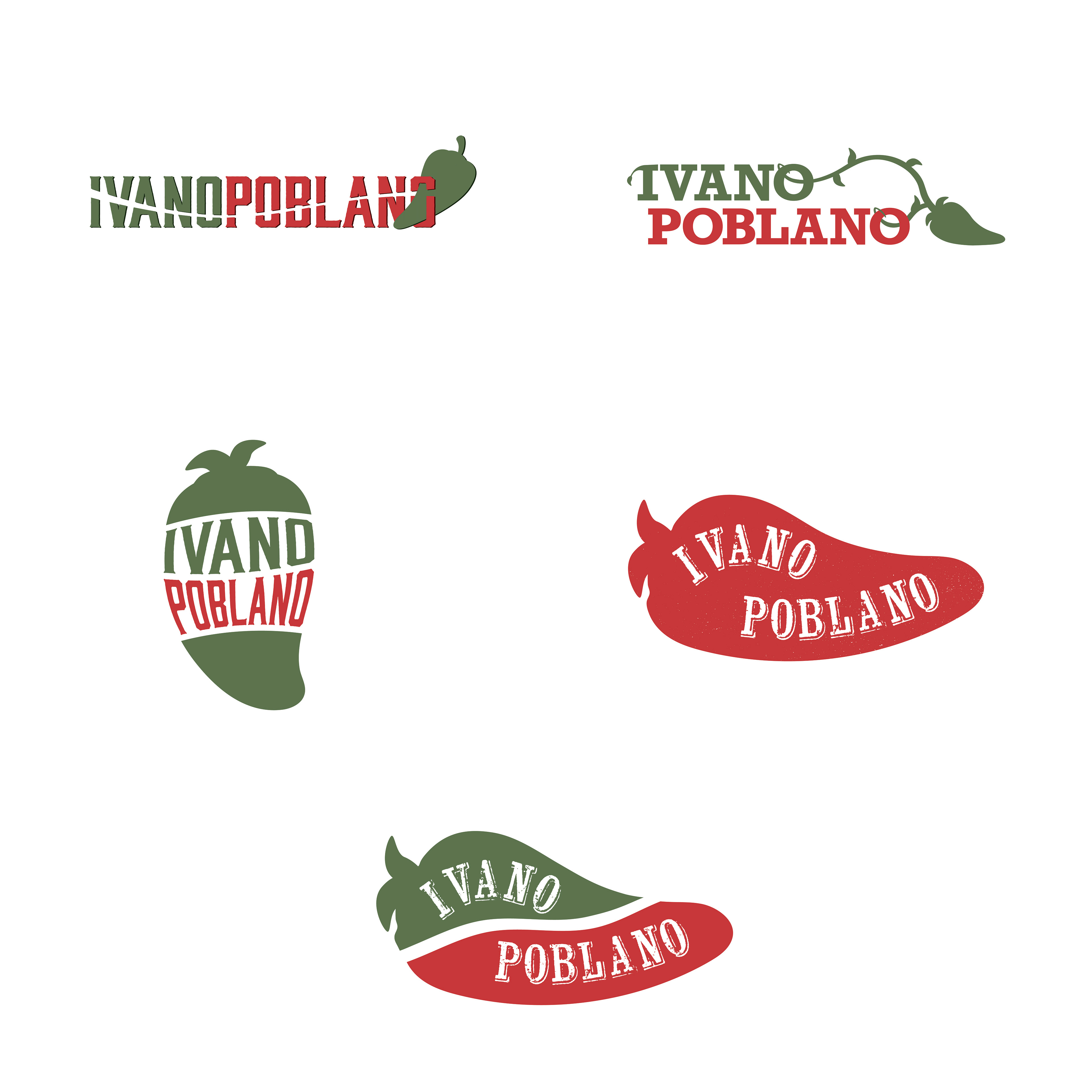
Brainstorming logo concepts
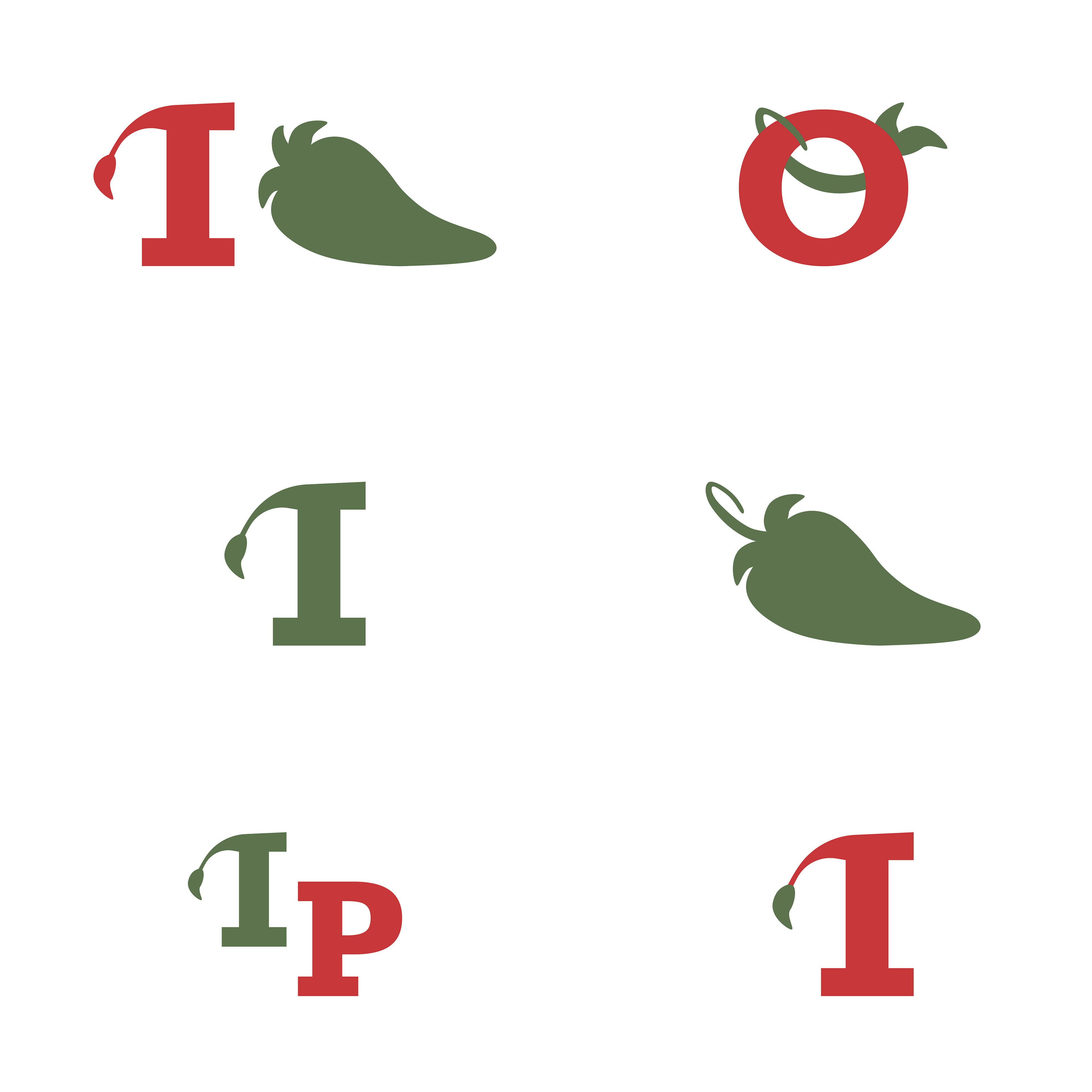
Brainstorming lettermark concepts
Site User Experience Design
I then developed a simple sitemap for the redesign. After this, I developed low-fidelity wireframing to get a feel for how I wanted the site to flow. I worked in shades of grey to demonstrate hierarchy and emphasis without getting bogged down by the more specific design details like colour, typography or imagery. In the instances that I would be directly transferring text from the original site, I would do so. However, if the text was going to be new, I left it at Lorem Ipsum at this stage. I took a similar approach for imagery.
During this wireframing stage, I also prototyped the site within Figma to ensure that users could move throughout the website as expected.
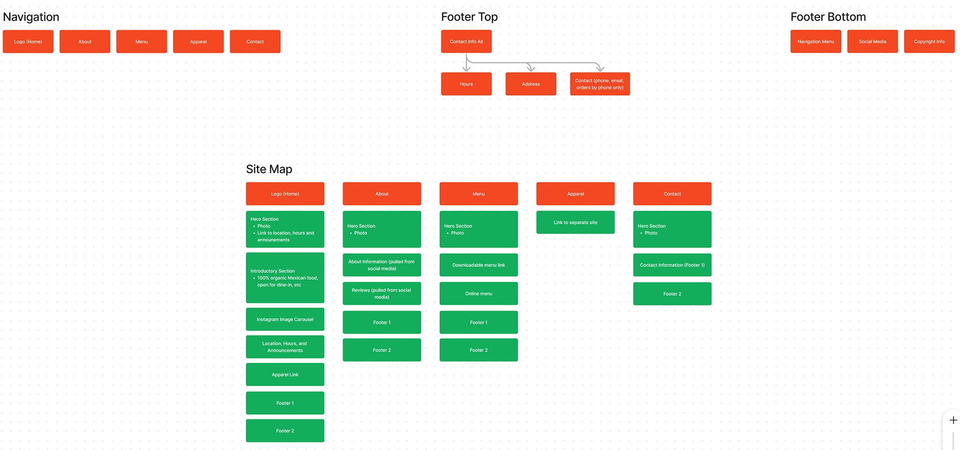
Sitemap for site redesign
Site redesign prototype
Graphic Design Redesign
Once the flow of the site was solidified, I added in the branding and redesigned colours, typography, hierarchy, and imagery. My goal was to keep the original green and reds, but desaturate them slightly so they felt more gentle on the eye. I reduced the typeface variations to two and used font and colour variations to make further distinctions as needed.

Contact section original

Contact section redesigned

Menu section original

Menu section redesigned

Introductory section original

